Some restaurants arrive with a presence that feels larger than their footprint. Mister Pio opened in 2024 in Phoenix’s Arcadia neighbourhood as a small counter-service spot and quickly became one of the most celebrated new restaurants in the United States. Its smoky rotisserie chicken gained a strong reputation early on, the lively interior sparked conversation, and its distinct visual identity stood out across every touchpoint.
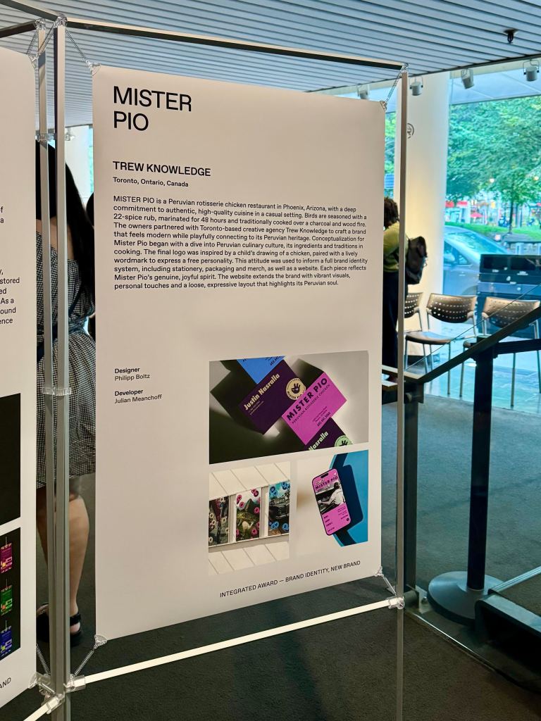
That identity came to life through our team at Trew Knowledge. We partnered with founders Justin Nasralla and David Goluboff to create a brand that reflects the richness of Peruvian culture while staying playful, modern, and full of character. The project went on to receive a Gold win at the 2025 RGD Branding Awards and earned an Honourable Mention from Awwwards, marking international recognition for both the visual and digital experience.
What follows is the story of how we shaped a brand designed to feel joyful, soulful, and unmistakably Peruvian.
A Concept Rooted in Peruvian Tradition
Mister Pio began with a friendship formed in Lima. Justin and David met in 2013 while studying culinary arts, building a shared love of Peruvian food culture that eventually guided their collaboration. Years of experience in fine dining gave them a strong technical foundation, but the concept they wanted to create took a different direction. Instead of tasting menus and elaborate plating, they imagined a place centred on pollo a la brasa, a rotisserie chicken style deeply rooted in Peruvian homes and neighbourhoods.
When they moved to Phoenix and found a corner space in Arcadia, the idea sharpened. A simple menu. Slow-roasted chicken using a rare Josper charcoal oven. A two-day dry brine with a signature spice blend. Organic produce from trusted farms. Premium Bell & Evans poultry. Classic Peruvian sauces made daily. Everything focused, nothing unnecessary.
This approach created space for a brand that needed to feel honest and vibrant. A restaurant built on simplicity and intention deserved an identity that matched that clarity.
Designing Mister Pio: Tradition, Joy, And A Child’s Chicken Drawing
Trew Knowledge entered the picture with a clear challenge: capture the heart of Peruvian rotisserie culture in a way that feels contemporary, joyful, and instantly distinctive. The goal was not to recreate a textbook version of Peruvian visual clichés. Instead, our team set out to translate the warmth of a family kitchen, the colour of local markets, and the rhythm of Lima’s streets into a flexible identity system.
“Conceptualization for Mister Pio began with a deep dive into its Peruvian heritage, its ingredients, traditions and cooking. It was a very, very insightful research and ultimately informed a very joyful and playful brand.”
— Philipp Boltz – Design Director at Trew Knowledge
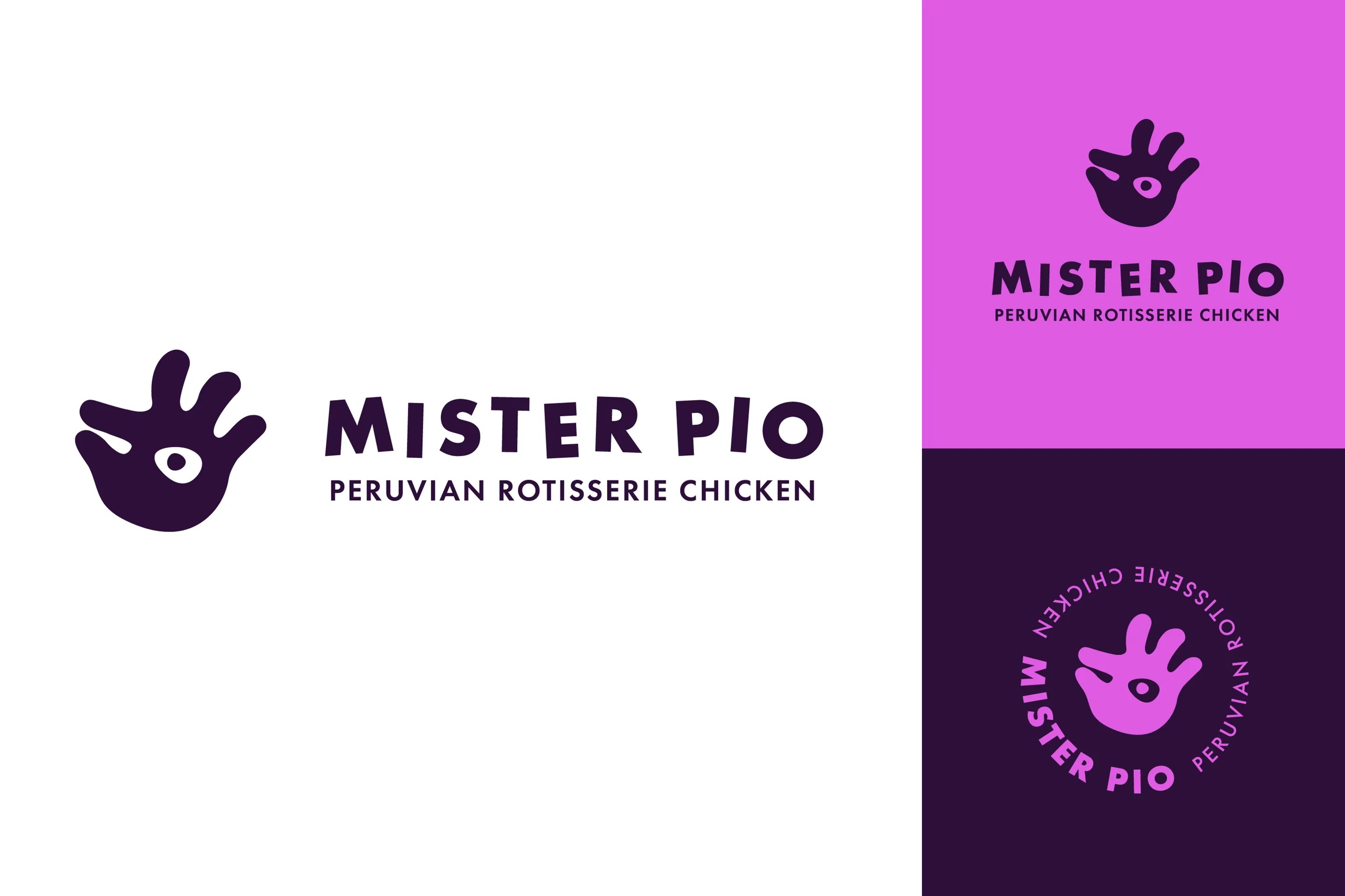
The turning point came from an unexpectedly simple source: a child’s drawing of a chicken. That naïve sketch carried a sense of innocence that felt perfect for Mister Pio. It communicated generosity without formality, craft without pretension. Our design team seized on that energy, using it as the foundation for the primary logo.
“As a designer, it’s always fun for me to look at some of the concepts that didn’t quite make the cut, such as chicken coop being on fire or a chicken being stabbed by a fork. Ultimately, we arrived at a logo that is inspired by a child’s drawing of a chicken, which perfectly underlines its joyful spirit and free personality.”
— Philipp Boltz – Design Director at Trew Knowledge
From there, tradition and joy became the two poles of the brand. The work had to respect Peruvian heritage, from textiles to typography, while maintaining a light touch that welcomed anyone walking in from the Arizona sun.

Building A Visual Identity That Feels Instantly Iconic
Colour System: Magenta And Deep Purple With Cultural Resonance
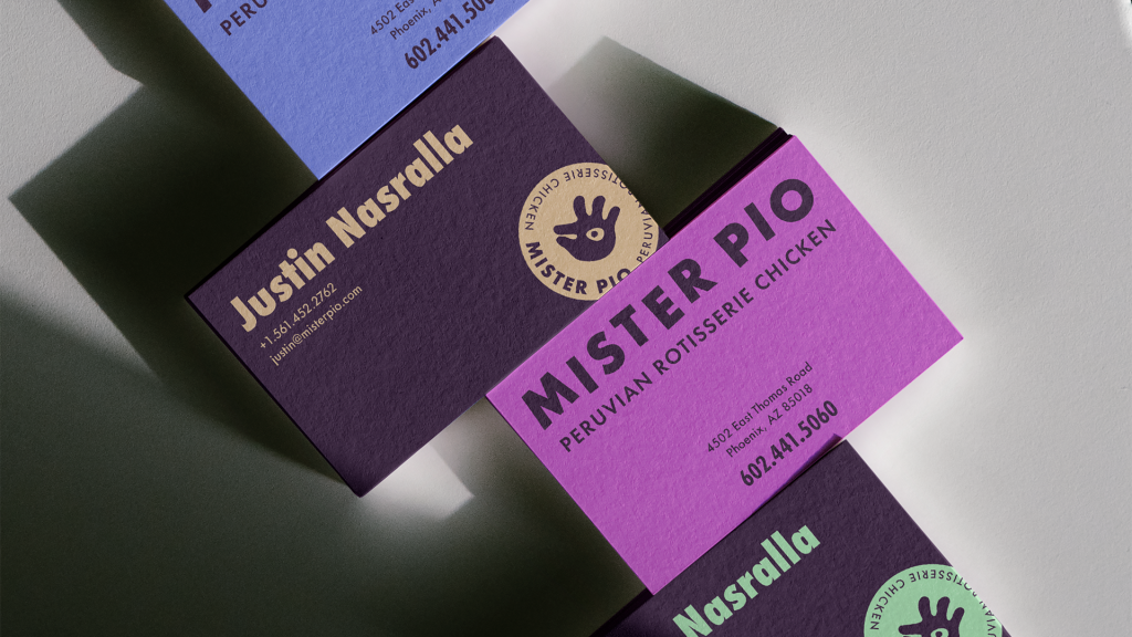
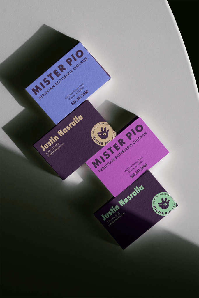
The colour palette quickly became one of Mister Pio’s most recognizable features. A vibrant magenta-purple sits at the core of the system, frequently paired with a deep, almost inky purple that provides contrast and depth. This pairing gives the brand a distinctive silhouette, whether it appears on a building facade, a menu, or a social tile.
These colours are not arbitrary. They nod to Peruvian textiles and ceremonial garments while still feeling fresh in a contemporary restaurant context. Accent tones, including yellow and green, show up in print pieces and interiors as subtle reminders of coins, spices, and market produce. Together, the palette signals warmth, celebration, and a hint of mystery.
Type And Supporting Styles: Warmth, Craft, And Personality
The typographic system leans into personality. Rounded sans-serif styles provide clarity for key information like menu items and wayfinding, while looser scripts or casual serif treatments appear in taglines, subheadings, or callouts. This layering keeps the brand from feeling flat. It suggests a place where craft matters, but where rules support hospitality rather than override it.
Graphic Language: Patterns, Stamps, And A Sense Of Place
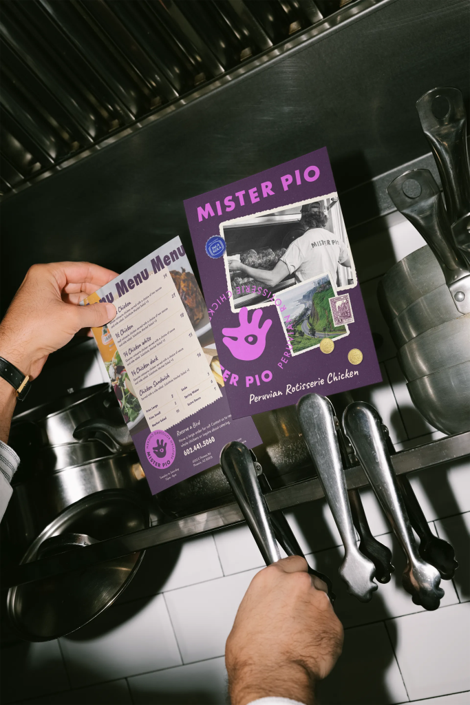
The visual identity does not stop at logo and colour. It draws on Peruvian motifs, giving the system a strong sense of place. Zigzag patterns recall Andean textiles. Postage-style stamps reference Lima and Cuzco. Illustrations of mountains, peppers, and traditional vessels appear in layouts, often treated with a collage-like sensibility.
These pieces show up on printed menus, in-store posters, and the website, creating continuity between physical and digital experiences. Rather than leaning on generic “Latin” iconography, the identity celebrates specific cultural references and weaves them into a cohesive whole.
Extending The Brand Across Restaurant, Packaging, And Merch
Interiors And Signage: Colour As Atmosphere
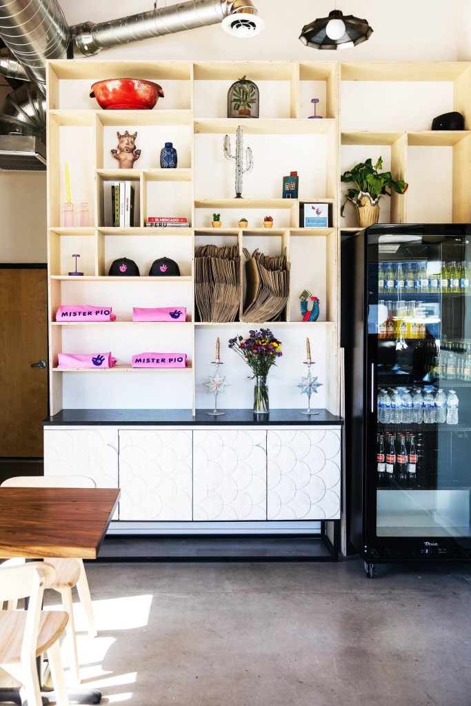
Step into Mister Pio and the brand is immediately present. The magenta and purple palette appears on walls, menus, and environmental graphics, often contrasted with the warm glow of the rotisserie and the earth tones of wood and stone. The chicken mark shows up as a beacon on signage, drawing the eye before the aroma from the charcoal oven takes over.
The space feels intimate and casual, without losing that sense of design intention. Visual elements never overshadow the food; they frame it.
Printed menus and takeout pieces carry the same visual language. A simple takeout box or a paper bag becomes a small billboard for the Mister Pio story, travelling across Phoenix every time someone carries dinner home.
The Digital Experience: A Website With As Much Personality As The Dining Room
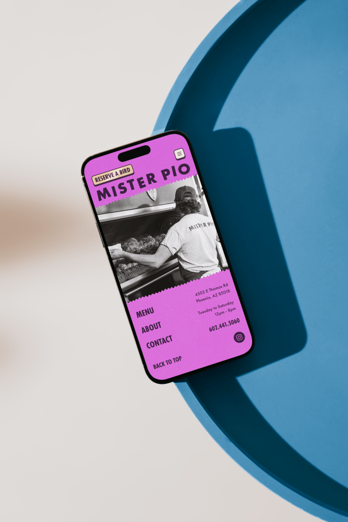
For many guests, the first interaction with Mister Pio happens on a screen rather than at the counter. Trew Knowledge approached the website as an extension of the restaurant, not a separate artifact. The homepage leads with bold imagery, expressive typography, and overlapping layers of content that mirror the energy of the physical space.
Subtle animation keeps the experience in motion without feeling busy. Visitors scroll past Peruvian stamps, market imagery, and shots of chicken platters that mirror what appears in the restaurant itself. The magenta and purple palette carries through, as do the patterns and supporting graphic elements.
Crucially, the site is not only about aesthetics. Practical tasks such as reviewing the menu, checking opening hours, or using the “Reserve a Bird” flow feel straightforward. Information is clearly presented, buttons are easy to find, and the navigation stays intuitive. The overall effect is a digital experience that feels as carefully seasoned as the food it represents.
Menu, Operations, And Brand: One Coherent System
Mister Pio does not try to be everything to everyone. The menu centres on Peruvian-style rotisserie chicken served in a handful of formats: quarter, half, or whole birds and a chicken sandwich, along with fries and salad.
This restraint is powerful. Instead of diluting attention across dozens of dishes, the restaurant pours energy into perfecting each component. Premium poultry, slow roasting over charcoal, house-made sauces, and carefully prepared sides create a sense of care that filters into the brand narrative. When the identity speaks about tradition and craft, the menu backs it up.
From Local Buzz to National Attention As A Standout New Restaurant
From the first months after opening, guests responded not only to the food but also to the overall experience. Reviews highlight smoky, tender chicken, crisp fries, fresh salads, and deeply flavourful sauces. Many also mention the atmosphere: the warmth of the staff, the energy of the space, and the way the branding contributes to a festive feel without tipping into gimmickry.
Coverage from outlets like Phoenix New Times and other regional publications positioned it as one of the city’s most exciting new arrivals, praising the combination of culinary pedigree and accessible menu. As word spread, Mister Pio began to appear beyond Phoenix’s local food press. National acclaim followed when Eater included Mister Pio on its list of the best new restaurants in the United States.
The narrative that emerges is consistent. This is a place where experienced chefs stepped away from fine dining to focus on something humble and deeply satisfying, supported by a brand that fully reflects that decision.
Branding Awards, DesignThinkers, And Awwwards Recognition
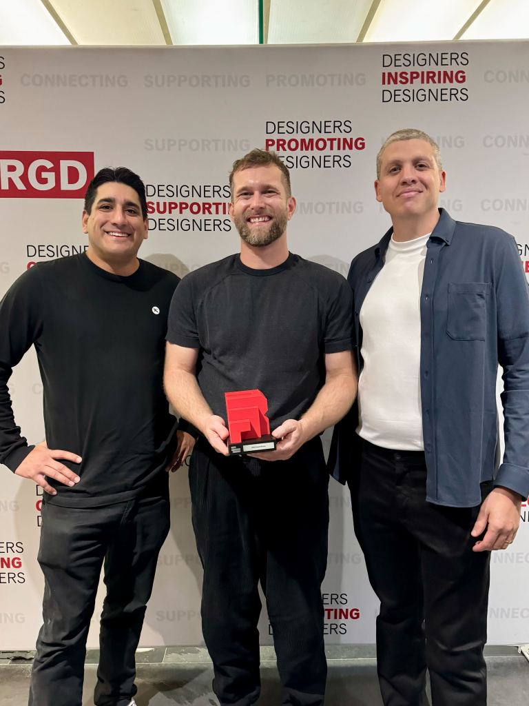
Mister Pio’s impact extends well beyond food media. The brand identity crafted by Trew Knowledge won a 2025 RGD Branding Award in the Brand Identity – New Brand category, a competition that brings together projects from across the globe. That recognition led to a showcase at DesignThinkers 2025, where the work appeared alongside top international branding projects.
The brand’s digital expression also received significant attention. The website earned an Honorable Mention at Awwwards, recognized for its expressive layout, vibrant visuals, and personal touches. It also received a W³ Award Gold in the Restaurant Website category, highlighting how the digital experience captures the warmth, colour, and energy that define the Mister Pio brand.
Taken together, these honours underline a simple reality: Mister Pio is not only a neighbourhood success story. It has become an example of how design, storytelling, and hospitality can reinforce one another.
What Mister Pio Reveals About Modern Hospitality Branding
Mister Pio offers more than a good meal and a nice-looking logo. It demonstrates a few principles that increasingly define successful hospitality brands.
Focus Amplifies Identity
The restaurant’s decision to concentrate on rotisserie chicken, salad, and fries gives the brand room to breathe. With a focused menu and clear operational model, the identity does not have to stretch in too many directions. It can lean fully into a single story and carry that through every touchpoint.
Cultural Storytelling Works Best When It Feels Genuine
Mister Pio’s identity integrates cultural elements as part of the foundation rather than decorative layers placed on top. Patterns, colours, and historical references are woven directly into the system so they influence structure, mood, and storytelling. This approach gives the brand a natural harmony. Cultural expression becomes embedded in the experience rather than acting as an accent, which strengthens the connection between the visual identity and the food itself.
Close Collaboration Raises The Bar
This project also shows the impact of a close relationship between founders and the agency. The owners shared stories, recipes, and references. Trew Knowledge translated those into a cohesive visual and digital system. The child’s drawing that inspired the logo only became powerful because both sides recognized its potential and committed to building around it.
In a sector where many brands feel interchangeable, this level of collaboration creates something that cannot easily be replicated.
A Joyful Brand, Carefully Crafted
Mister Pio Peruvian Rotisserie Chicken is proof that a small restaurant can carry the presence of a much larger brand when every element is aligned.
Trew Knowledge helped turn that vision into a complete system, from the hand-drawn chicken mark and magenta palette to the website that welcomes guests, showcases the menu, and celebrates the signature Peruvian rotisserie that defines the experience.
The same approach can support other restaurants and hospitality brands that carry a strong story but need the right tools to tell it. With strategic branding, thoughtful digital design, and an understanding of how operations and identity inform one another, even a single-location concept can build a presence that reaches far beyond its immediate neighbourhood.
For teams ready to bring a hospitality vision to life with this level of care, Trew Knowledge offers branding, digital experience, and enterprise web services that connect story, strategy, and execution. Reach out to explore how that partnership can turn a strong concept into a memorable brand.
