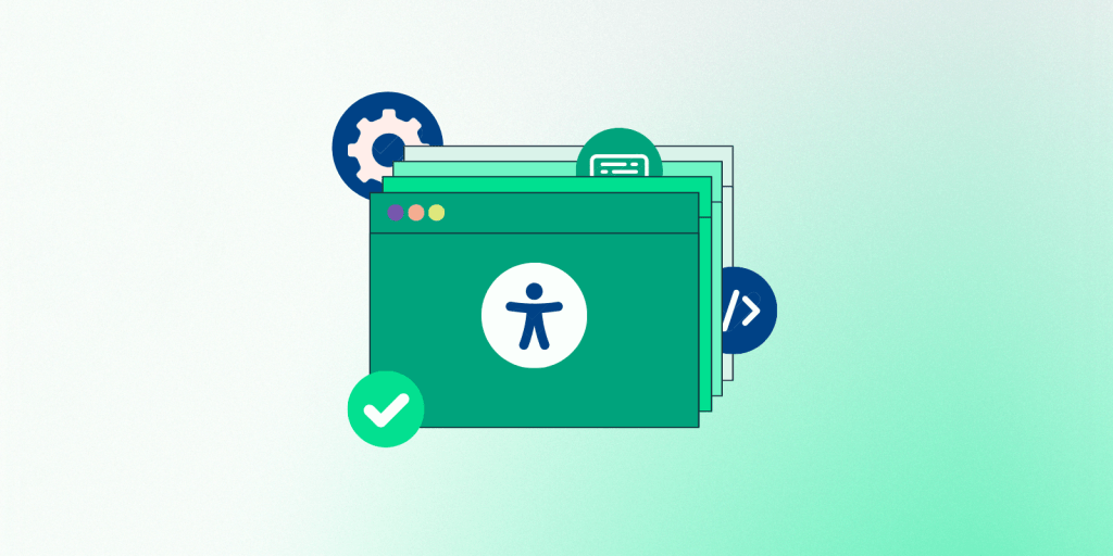
Ensuring web accessibility isn’t just about meeting standards—it’s about leading with innovation and setting a precedent for digital equality. With intricate ARIA applications that breathe life into dynamic content and finely-tuned navigation adjustments for non-traditional inputs, we challenge you to think differently about accessibility. These ten lesser-known strategies are not merely tools but invitations to craft experiences that open doors and warmly welcome everyone.
1. ARIA Roles for Dynamic Content
Dynamic content poses unique accessibility challenges because changes in the UI are not automatically communicated to users who can’t see the screen. For instance, when a modal dialogue opens, or a section of the page updates in real-time, users relying on screen readers might not be aware unless these changes are explicitly announced. Accessible Rich Internet Applications (ARIA) roles are pivotal in helping assistive technologies decipher the function of dynamic web elements such as modal dialogs, live notifications, and custom dropdowns.
Here’s how you can implement ARIA roles strategically to enhance accessibility for dynamic content:
ARIA Roles: Assign roles like alert, dialog, tooltip, and status to UI elements that play specific roles in interactions. For example, assigning role= “dialog” to modal pop-ups helps screen reader users understand that they’ve entered a modal dialog box.
Properties and States: ARIA attributes can also define properties and states of elements. Attributes like aria-expanded, aria-hidden, and aria-live provide crucial information about the element’s state. For example, aria-expanded= “true” or false” indicates whether a dropdown or accordion is open or closed, aiding users in navigating content effectively.
2. ARIA Live Regions for Real-Time Updates
ARIA live regions are invaluable for content that updates automatically, such as live sports scores or changing stock values. They allow screen readers to announce changes automatically as they happen, keeping users with visual impairments informed in real-time.
Implementing ARIA Live Regions
Markup: Add the aria-live attribute to a container element to implement a live region. This attribute can take several values:
– off: Changes are not announced (default).
– polite: Changes are announced when the user is idle, ensuring that the screen reader doesn’t interrupt the user’s current task.
– assertive: Changes are announced immediately and are suitable for urgent updates.
Choosing the Right Mode
– Use polite for non-urgent but timely information, such as updating news feeds or stock prices.
– Use assertive for urgent notifications, such as error messages or warnings that require immediate attention.
Best Practices for ARIA Live Regions
Minimal Use: Overuse of live regions can lead to noisy experiences where too much information is being read out, often at the expense of critical ongoing tasks. Use them sparingly and only where necessary. To prevent overwhelming the user, manage how updates are presented within live regions.
Avoid Dynamic Changes in Live Regions: Dynamically adding or removing the aria-live attribute can cause inconsistencies across screen readers. Instead, it is better to include the attribute in the HTML from the start, even if the updates are not active immediately.
Clear and Concise Messages: The text announced via live regions should be clear, concise, and devoid of unnecessary fluff. Since the context is not visually perceivable, the content must stand independently for clarity and comprehension.
Implementing these ARIA roles and properties requires careful consideration. Testing with various assistive technologies and users is essential to ensure that the ARIA roles enhance the user experience without overwhelming or confusing screen reader users.
3. Keyboard Navigation for Custom Controls
Ensuring all interactive components, including custom-designed controls like sliders or carousels, are fully operable via keyboard is essential. This practice helps users who cannot use a mouse to navigate smoothly through your site.
4. Enhanced Colour Contrast in Subtle UI Components
Colour contrast is often considered for large text blocks, but what about the less noticeable elements? Placeholder texts, secondary buttons, and even icons need sufficient contrast to be perceivable by users with visual impairments.
5. Visible Focus Indicators
It’s common to see custom styles that remove focus outlines from elements for aesthetic reasons. However, these outlines are critical for users navigating via the keyboard as they indicate which element is currently active.
Best Practices for Implementing Focus Indicators
Custom Styling: While browsers provide a default focus outline, it may not always be visually distinct or align well with the website’s design aesthetic. Customizing these focus styles (using CSS :focus or :focus-visible pseudo-classes) allows designers to create focus indicators that are both functional and harmonious with the site’s design. For example, combining colour changes, underlines, or border enhancements can make the focus state prominent and clear.
Consistency Across the Site: Ensure that all interactive elements across the website have a consistent focus style. This consistency helps users predict and understand how to interact with the site more effectively.
Avoiding Removal: It’s crucial to prevent removing the focus outline entirely unless it is immediately replaced with an equally clear indicator. Even if the design protocol finds them visually unappealing, their functionality is too necessary to compromise.
6. Error Identification Beyond Color
Simply changing the colour of the text to indicate an error (like turning it red) may not be enough for colour-blind users. Including icons, specific error messages, or label modifications can provide more precise feedback to all users.
7. Accessibility in PDFs
When offering downloadable content such as PDFs, ensure these documents are accessible. This includes using proper tags, readable fonts, descriptive headings, and alternative texts for images.
8. Consistent Navigation
Users with cognitive disabilities benefit immensely from consistent navigation structures. Predictable and straightforward navigation aids in better understanding and interacting with the website or app.
9. Optimized Text Clarity and Readability
Improving text clarity goes beyond font size and colour. To help users with dyslexia or other reading difficulties, consider enhancing readability by using plain language, adjusting line spacing, and avoiding justified text.
10. Voice Command Accessibility
As voice-controlled interfaces become more prevalent, optimizing your website for voice commands can enhance accessibility. This includes structuring easily navigable content through speech and accommodating voice input for forms and navigation.
Looking for More Accessibility Insights?
Don’t miss out on WordPress Accessibility Day 2024! Scheduled for October 9th at 2:45 PM UTC (9:45 AM America/Chicago), this 24-hour live-streamed event is your go-to resource for the latest in WordPress accessibility practices. Whether you’re just starting or looking to refine your skills, you’ll find invaluable resources and like-minded individuals. Visit the event site for more details.
Stay informed and engaged—help us make the internet a more accessible place for all!